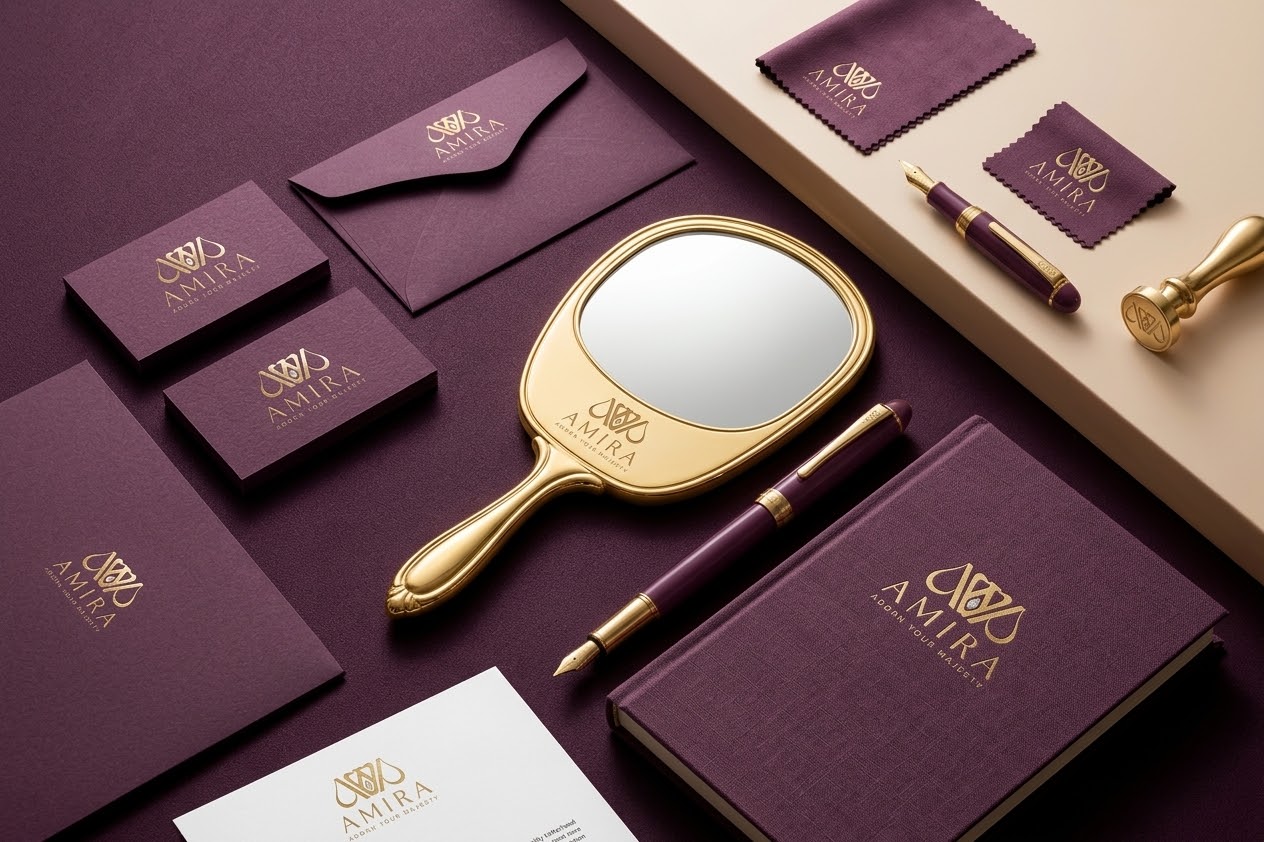
Amira
Logo Design

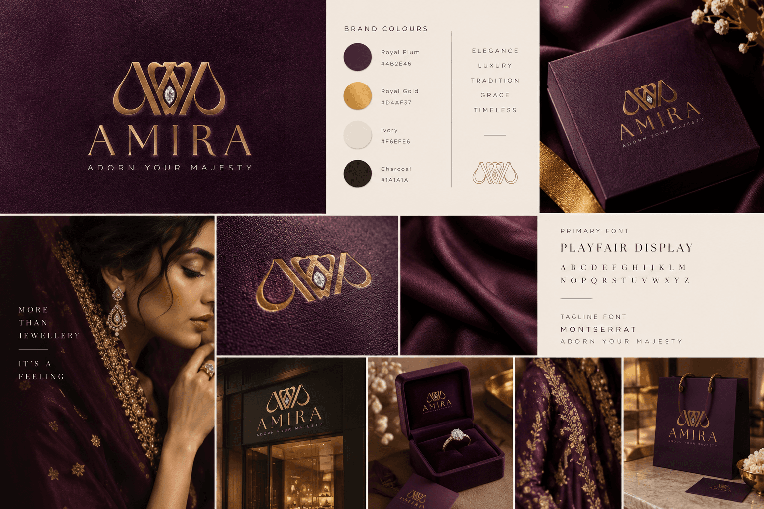
Amira is a jewelry brand centered around timeless elegance and royal-inspired design. The goal was to create a complete brand identity logo, color palette, and typography that reflects luxury, femininity, and craftsmanship, positioning Amira as a premium choice in a competitive jewelry market
Client:
Amira Jwellers
Role:
Logo Design
Year:
2022

Explore the full story –
Challenge
The client wanted a mark that felt regal and premium without leaning on jewelry design clichés like plain diamond outlines or generic script fonts. The logo needed to work as a strong standalone icon (for social/app use) while also pairing elegantly with the full wordmark for packaging and print.
Objective
I started with research and moodboarding to explore luxury and jewelry-inspired visual references, then sketched multiple monogram concepts blending crown and gem motifs. After refining the strongest direction, I finalized the color palette and typography, and tested the logo across foil, embossed, and digital mockups for versatility.
Results
The concept drew inspiration from a crown and a teardrop-shaped gem merging both into a single monogram that reads as an abstract "A" (for Amira) with a diamond nestled at its center. This dual symbolism reinforces both royalty ("majesty") and jewelry (the gem) in one mark.