Serena Leaf
Branding
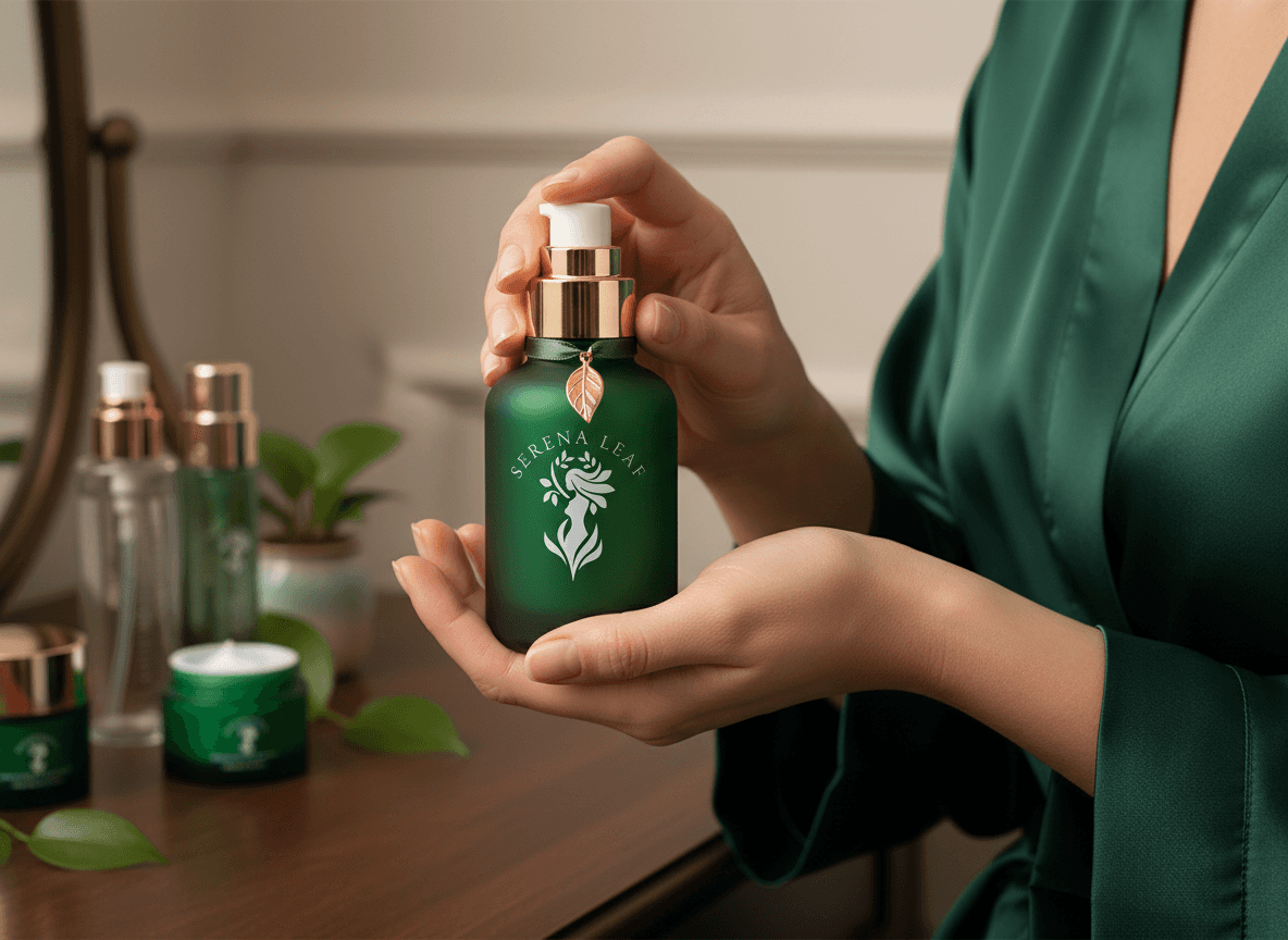
Serena Leaf is an organic beauty and wellness brand rooted in the idea that true beauty grows from nature. The goal was to create a complete brand identity logo, color system, pattern, and stationery that feels premium, feminine, and deeply connected to nature, avoiding the generic "eco-brand" clichés common in this space.
Client:
Serena Leaf
Role:
Graphic Designer
Year:
2026


Explore the full story –
Challenge
The brand needed to stand out in a crowded organic beauty market where "natural" branding often looks generic plain leaves, soft pastels, predictable typography. The identity had to feel premium and distinctive while clearly communicating a nature-rooted, wellness-focused message, and translate consistently across packaging, stationery, and retail bags.
Objective
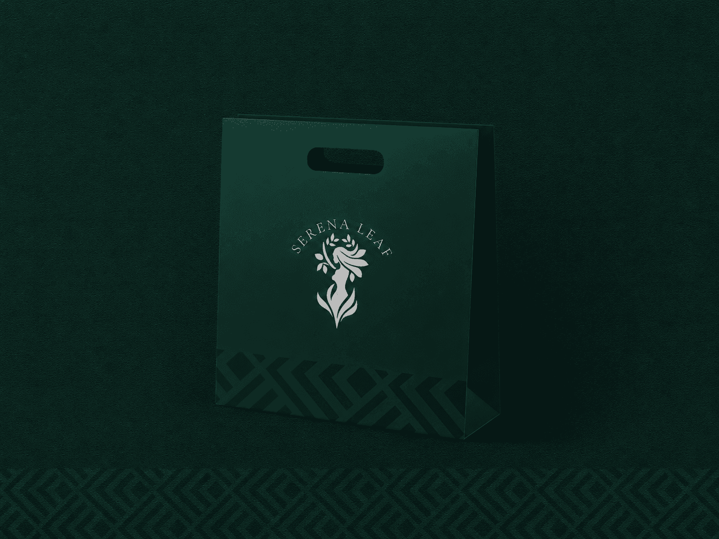
The core idea "beauty that grows from nature" led to a mark that merges a woman's silhouette with leaves and floral forms. This single emblem symbolizes the connection between feminine beauty and organic self-care, making the logo both meaningful and visually distinctive.
Results
The final identity gave Serena Leaf a distinctive, premium presence that avoids typical "organic brand" clichés. The deep green palette paired with the recurring geometric pattern created strong visual consistency across business cards, letterhead, packaging, and shopping bags, resulting in a logo concept that clearly communicates the brand's core message beauty rooted in nature.